The Matplotlib package is the most fundamental and core package for data visualization in Python. The plotting functions in Seaborn and pandas (introduced later) are further developments based on Matplotlib. This section introduces the most basic plotting functions of Matplotlib, including coordinate system settings, and configurations for points, lines, surfaces, and text. We also cover drawing several common chart types.
Using Matplotlib for Plotting in Excel’s Built-in Python
Below, we use the data in cell range A1:C5 of the worksheet (Figure 7-1) to draw a composite line chart. Enter PY( in cell D1 to enter Python mode, then input the plotting code in the formula bar.
First, import the matplotlib.pyplot submodule (aliased as plt). Note: In Excel’s built-in Python, plt can be used directly to represent matplotlib.pyplot, so this line can be omitted.
import matplotlib.pyplot as pltReference the data in cell range A1:C5 and assign it to a DataFrame variable df:
df = xl("A1:C5", headers=True)Plot line charts for consecutive rows of data with colors red, green, blue, and yellow:
plt.plot(df.columns[1:3], df.iloc[0, 1:3], 'r')
plt.plot(df.columns[1:3], df.iloc[1, 1:3], 'g')
plt.plot(df.columns[1:3], df.iloc[2, 1:3], 'b')
plt.plot(df.columns[1:3], df.iloc[3, 1:3], 'y')
Press Ctrl+Enter in the formula bar. Cell D1 returns an Image object. Display this object by merging cell range E1:H11, and the composite line chart will be shown as in Figure 7-1.
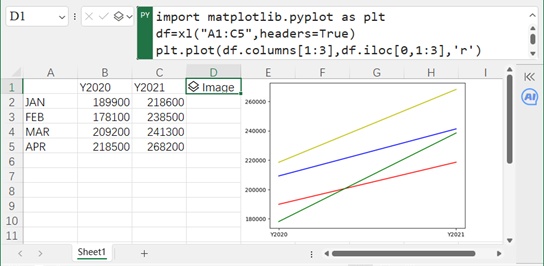
Figure 7-1
Through testing, we find several differences when using Matplotlib in Excel’s built-in Python compared to a Python IDE:
plt can be used directly without re-importing.
Data referencing methods differ.
No need to create a figure window.
No need for plt.show() to display the chart.
Chinese characters are not supported.
Coordinate System: Setting Axis Titles
The coordinate system is a core element of a chart. Once the coordinate system is defined, the position, size, length, angle, and direction of each point, line, and surface in the chart can be determined (it serves as a reference frame). Elements related to the coordinate system include axes, axis titles, tick marks, gridlines, etc.

Figure 7-2
Matplotlib uses the xlabel() and ylabel() functions to set titles for the x-axis and y-axis. In the worksheet shown in Figure 7-2, cell D1 is in Python mode. Input the following code in the formula bar to add titles to the line chart (which originally had no axis titles):
df = xl("A1:C5", headers=True)
plt.plot(df.columns[1:3], df.iloc[0, 1:3], 'r')
plt.plot(df.columns[1:3], df.iloc[1, 1:3], 'g')
plt.xlabel('Year', fontsize=18)  # Set x-axis label
plt.ylabel('Sales Volume', fontsize=18)  # Set y-axis label
Press Ctrl+Enter to return an Image object. Merge cell range E1:H11 to display the result (Figure 7-2).
Coordinate System: Setting Tick Marks
By default, Matplotlib charts include tick marks and tick labels. In Figure 7-2, the tick labels are too small to read clearly. We set the font size to 16 points using the xticks() and yticks() functions. The minorticks_on() and minorticks_off() functions control the display of minor tick marks.
In cell D1 (Python mode), input the following code:
df = xl("A1:C5", headers=True)
plt.plot(df.iloc[:, 0], df.iloc[:, 1], 'r')
plt.minorticks_on()  # Show minor tick marks
labels = ['January', 'February', 'March', 'April']
plt.xticks(df.iloc[:, 0], labels, fontsize=16)  # Set x-axis tick labels
plt.yticks(fontsize=16)  # Set y-axis tick label font size to 16 points
Press Ctrl+Enter to return an Image object. Merge cell range E1:H11 to display the result (Figure 7-3).

Figure 7-3
Coordinate System: Setting Axis Ranges
Matplotlib uses the xlim() and ylim() functions to set the range of the x-axis and y-axis (typically for numerical axes). In the worksheet shown in Figure 7-4, cell D1 (Python mode) inputs the following code to set the y-axis range to 150,000–280,000:
df = xl("A1:C5", headers=True)
plt.plot(df.columns[1:3], df.iloc[0, 1:3], 'r')
plt.plot(df.columns[1:3], df.iloc[1, 1:3], 'g')
plt.ylim(150000, 280000)
plt.xticks(fontsize=16)
plt.yticks(fontsize=16)
Press Ctrl+Enter to return an Image object. Merge cell range E1:H11 to display the result (Figure 7-4).

Figure 7-4
Use the following statement to set both x-axis and y-axis ranges simultaneously. The first two elements in the list represent the minimum and maximum of the x-axis; the last two represent the minimum and maximum of the y-axis:
plt.axis([1, 10, 1, 10])The following statements set the axis to "tight" (compact) or "equal" (proportional) mode:
plt.axis('tight')
plt.axis('equal')
Coordinate System: Setting Gridlines
Matplotlib uses the grid() function to set gridlines corresponding to x-axis and y-axis tick marks. In the worksheet shown in Figure 7-5, cell D1 (Python mode) inputs the following code to display gridlines for major and minor ticks (using dotted lines):
df = xl("A1:C5", headers=True)
plt.plot(df.iloc[:, 0], df.iloc[:, 1], 'r')
plt.xticks(fontsize=16)
plt.yticks(fontsize=16)
plt.grid(visible=True, which='both', axis='both', linestyle=':')
Press Ctrl+Enter to return an Image object. Merge cell range E1:H11 to display the result (Figure 7-5).
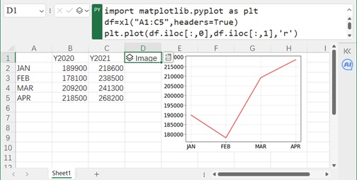
Figure 7-5
The which parameter in grid() specifies whether to apply to major ticks, minor ticks, or both (values: 'major', 'minor', 'both'). The axis parameter specifies the axis (values: 'both', 'x', 'y').
Coordinate System: Setting Axis Scales
Matplotlib uses loglog(), semilogx(), and semilogy() to draw log-log plots, x-semi-log plots, and y-semi-log plots, respectively. In the worksheet shown in Figure 7-6, cell D1 (Python mode) inputs the following code to draw a y-semi-log plot:
df = xl("A1:B5", headers=True)
plt.semilogy(df.iloc[:, 0], df.iloc[:, 1], 'r')
plt.xticks(fontsize=16)
plt.yticks(fontsize=16)
plt.minorticks_on()
Press Ctrl+Enter to return an Image object. Merge cell range E1:H11 to display the result (Figure 7-6). Note: The y-axis major ticks use logarithmic spacing.

Figure 7-6
Coordinate System: Dual-Axis Charts
Matplotlib uses the twinx() and twiny() methods of the axis object to create dual-axis charts (sharing the x-axis or y-axis, allowing two charts with different coordinate systems in one figure). In the worksheet shown in Figure 7-7, cell B1 (Python mode) inputs the following code to draw a dual-axis chart sharing the x-axis:
t = np.arange(0, 7, 0.1)
y1 = np.exp(t)
y2 = np.cos(t)
r = plt.subplots()
ax1 = r[1]  # Left y-axis
ax1.plot(t, y1, 'r')  # Plot on left axis
ax2 = ax1.twinx()  # Create right y-axis
ax2.plot(t, y2, 'g')  # Plot on right axis
# Set font size for tick labels
ax1.set_xticklabels(ax1.get_xticklabels(), fontsize=16)
ax1.set_yticklabels(ax1.get_yticklabels(), fontsize=16)
ax2.set_yticklabels(ax2.get_yticklabels(), fontsize=16)
Press Ctrl+Enter to return an Image object. Merge cell range C1:F11 to display the result (Figure 7-7). The exponential curve uses the left y-axis; the cosine curve uses the right y-axis.
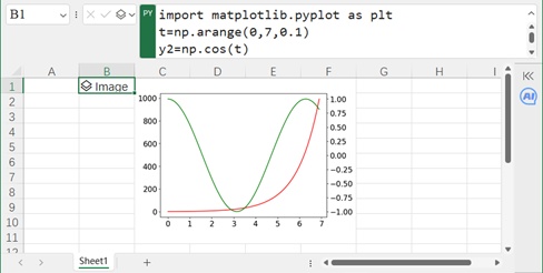
Figure 7-7
Setting Point Element Properties
Complex charts are composed of basic elements like points, lines, surfaces, and text. Before plotting, it is essential to understand how Matplotlib draws and configures these elements. This section first covers point element properties, including marker type, size, face color, and edge color.
Color Settings
Point colors can be specified in multiple ways: using color names (full or abbreviated), RGB/RGBA tuples, or hexadecimal integers.
Color Names: Full names (e.g., 'green') or abbreviations (e.g., 'g') are supported. Common colors are listed in Table 7-1.
RGB/RGBA Tuples: Each component (red, green, blue, alpha/transparency) ranges from 0–1. For example, (1.0, 0.0, 0.0) is red; (0.1, 0.2, 0.5, 0.3) includes 30% transparency (0 = opaque, 1 = fully transparent).
Hexadecimal Integers: Six digits after # represent RGB components (e.g., #FF0000 = red).
Other Methods: Gray levels (0 = black, 1 = white) or tuples like ('green', 0.3) (green with 30% transparency).
Matplotlib uses color for face color and markeredgecolor for edge color of point markers.
Marker Type Settings
Markers can be shapes like circles, triangles, diamonds, stars, etc. Use the markerstyle parameter with values like '.', 'o', 'v', '^', '<', '>', '8', 's', 'p', '*', 'h', 'H', 'D', 'd', 'P', 'X'.
Marker Size Settings
Use the markersize parameter (integer, in points) to set marker size.
Example
In the worksheet shown in Figure 7-8, cell A7 (Python mode) inputs the following code to draw a scatter plot of 2020 sales data:
df = xl("A1:C5", headers=True)
plt.plot(df.iloc[:, 0], df.iloc[:, 1], 'ro')  # 'r'=red, 'o'=circle marker
plt.xticks(fontsize=16)
plt.yticks(fontsize=16)
Press Ctrl+Enter to return an Image object. Merge cell range B7:E15 to display the result (left plot in Figure 7-8).
Cell F7 (Python mode) inputs code to draw a scatter plot with custom styles:
df = xl("A1:C5", headers=True)
plt.plot(df.iloc[:, 0], df.iloc[:, 1], 'b*', markersize=16, markeredgecolor='r')  # 'b'=blue, '*'=star marker
plt.xticks(fontsize=16)
plt.yticks(fontsize=16)
Press Ctrl+Enter to return an Image object. Merge cell range G7:J15 to display the result (right plot in Figure 7-8).
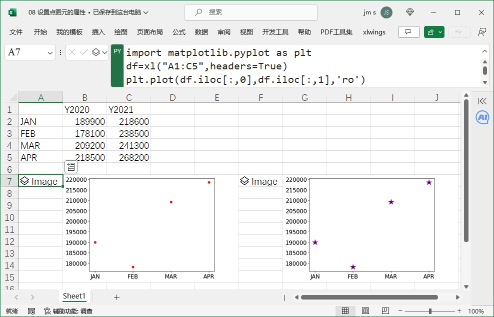
Figure 7-8
Setting Line Element Properties
Line elements include straight lines, polylines, axes, tick marks, gridlines, surface edges, and legend lines. Their properties include color, width, and style.
Color: Same as point color settings (Section 7.1.8).
Width: Use the linewidth parameter (integer, in points).
Style: Use the linestyle parameter (Table 7-2). Common styles: solid ('-'), dashed ('--'), dash-dot ('-.'), dotted (':').
In the worksheet shown in Figure 7-9, cell A7 (Python mode) inputs code to draw a line chart of 2020 sales data:
df = xl("A1:C5", headers=True)
plt.plot(df.iloc[:, 0], df.iloc[:, 1], 'r-.o')  # 'r'=red, '-.'=dash-dot line, 'o'=circle marker
plt.xticks(fontsize=16)
plt.yticks(fontsize=16)
Press Ctrl+Enter to return an Image object. Merge cell range B7:E15 to display the result (left plot in Figure 7-9).
Cell F7 (Python mode) inputs code for a custom line style:
df = xl("A1:C5", headers=True)
plt.plot(df.iloc[:, 0], df.iloc[:, 1], 'r-.*', linestyle='-', linewidth=3, color='g', markersize=16)
plt.xticks(fontsize=16)
plt.yticks(fontsize=16)
Press Ctrl+Enter to return an Image object. Merge cell range G7:J15 to display the result (right plot in Figure 7-9).
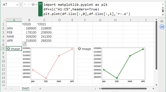
Figure 7-9
Setting Surface Element Properties
Surface elements include marker faces, bars in bar charts, sectors in pie charts, plot areas, and legend boxes. Their properties include color and transparency.
Matplotlib uses:
color: Face color.
edgecolor: Edge color.
linewidth: Edge width.
alpha: Transparency (0 = opaque, 1 = fully transparent).
In the worksheet shown in Figure 7-10, cell A7 (Python mode) inputs code to draw a bar chart of 2020 sales data:
df = xl("A1:C5", headers=True)
plt.bar(df.iloc[:, 0], df.iloc[:, 1])
plt.xticks(fontsize=16)
plt.yticks(fontsize=16)
Press Ctrl+Enter to return an Image object. Merge cell range B7:E15 to display the result (left plot in Figure 7-10; default bar color is blue).
Cell F7 (Python mode) inputs code for custom bar styles:
df = xl("A1:C5", headers=True)
plt.bar(df.iloc[:, 0], df.iloc[:, 1], color='g', edgecolor='r', linewidth=3, alpha=0.5)  # Green face, red edge, 50% transparent
plt.xticks(fontsize=16)
plt.yticks(fontsize=16)
Press Ctrl+Enter to return an Image object. Merge cell range G7:J15 to display the result (right plot in Figure 7-10).
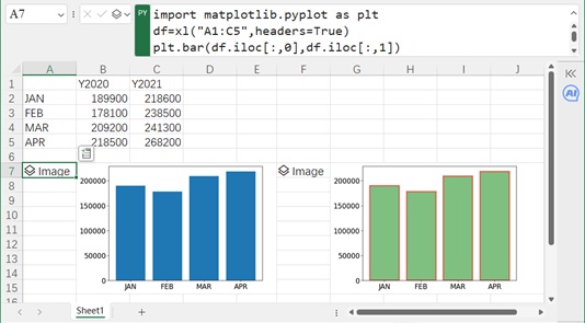
Figure 7-10
Setting Text Properties
Text elements (titles, labels, annotations) are critical to charts. Their properties include position, content, background color, and font attributes (family, size, color, bold, italic). Use the text() function to add text.
In the worksheet shown in Figure 7-11, cell D1 (Python mode) inputs code to draw a line chart of 2020 sales data and add text:
df = xl("A1:C5", headers=True)
plt.plot(df.iloc[:, 0], df.iloc[:, 1], 'r-o')
# Add text: position ('FEB', 200000), content 'Text', font family 'fantasy', size 20, bold, italic, yellow background
plt.text('FEB', 200000, 'Text', fontfamily='fantasy', fontsize=20, fontweight=True, fontstyle='italic', backgroundcolor=(1, 1, 0))
plt.xticks(fontsize=16)
plt.yticks(fontsize=16)
Press Ctrl+Enter to return an Image object. Merge cell range E1:H10 to display the result (Figure 7-11).
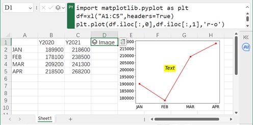
Figure 7-11
Setting Chart Title, Data Labels, and Legend
Additional chart elements include the title, data labels, and legend.
Title: Use title() to set the title and its font properties.
Legend: Use legend() to set labels, position, and font properties.
Data Labels: Use text() to add labels at each data point.
In the worksheet shown in Figure 7-12, cell D1 (Python mode) inputs code to draw a composite line chart of 2020–2021 sales data and add elements:
df = xl("A1:C5", headers=True)
plt.plot(df.iloc[:, 0], df.iloc[:, 1], 'r-o')  # 2020 data
plt.plot(df.iloc[:, 0], df.iloc[:, 2], 'g-*')  # 2021 data
plt.title(label='Sales In 2020-2021', fontsize=20)  # Chart title
plt.xticks(fontsize=16)
plt.yticks(fontsize=16)
lbs = df.columns[1:3]  # Legend labels(Y2020, Y2021)
plt.legend(labels=lbs, loc='upper left', fontsize=16)  # Legend
# Add data labels
for i in range(4):
    plt.text(df.iloc[i, 0], df.iloc[i, 1], df.iloc[i, 1], va='top', fontsize=16)
Press Ctrl+Enter to return an Image object. Merge cell range E1:H10 to display the result (Figure 7-12).

Figure 7-12
Point Plots and Line Charts
Section 7.1.8 covered point plots (no line segments between points if no line style is specified). Sections 7.1.9–7.1.12 covered simple/composite line charts (details omitted here).
Bar Charts
Bar charts use rectangles of varying heights to represent data. Compared to point/line charts, they are more直观. Section 7.1.10 used bar() to draw simple bar charts with custom colors/transparency.
Below, we draw two types of composite bar charts (overlapping and side-by-side) using Matplotlib (Figure 7-13).
In the worksheet shown in Figure 7-13, cell A7 (Python mode) inputs code for an overlapping composite bar chart:
df = xl("A1:C5", headers=True)
# Draw first bar series (Y2021)
plt.bar(df.iloc[:, 0], df.iloc[:, 2], width=0.5, color='g')
# Draw second bar series (Y2020, wider and semi-transparent)
plt.bar(df.iloc[:, 0], df.iloc[:, 1], width=0.8, color='b', alpha=0.6)
plt.xticks(fontsize=16)
plt.yticks(fontsize=16)
lbs = ['Y2021', 'Y2020']
plt.legend(labels=lbs, loc='upper left', fontsize=16)
Press Ctrl+Enter to return an Image object. Merge cell range B7:E16 to display the result (left plot in Figure 7-13).
Cell F7 (Python mode) inputs code for a side-by-side composite bar chart:
df = xl("A1:C5", headers=True)
t = np.array([1, 2, 3, 4])
# Draw first bar series (Y2020)
plt.bar(t, df.iloc[:, 1], width=0.25, color='b')
# Draw second bar series (Y2021, shifted by 0.25 to avoid overlap)
plt.bar(t + 0.25, df.iloc[:, 2], width=0.25, color='g')
ts = ['JAN', 'FEB', 'MAR', 'APR']
plt.xticks(t + 0.125, ts, fontsize=16)  # Center x-ticks between bars
plt.yticks(fontsize=16)
lbs = df.columns[1:3]
plt.legend(labels=lbs, loc='upper left', fontsize=16)
Press Ctrl+Enter to return an Image object. Merge cell range G7:J16 to display the result (right plot in Figure 7-13).
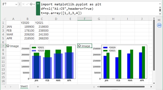
Figure 7-13
Area Charts
Area charts fill polygonal regions with color to represent data magnitude. Use stackplot() to draw simple or composite area charts.
In the worksheet shown in Figure 7-14, cell A7 (Python mode) inputs code for a simple area chart of 2020 sales data:
df = xl("A1:C5", headers=True)
plt.stackplot(df.iloc[:, 0], df.iloc[:, 1], color='y')  # Yellow fill
plt.xticks(fontsize=16)
plt.yticks(fontsize=16)
Press Ctrl+Enter to return an Image object. Merge cell range B7:E16 to display the result (left plot in Figure 7-14).
Cell F7 (Python mode) inputs code for a composite area chart of 2020–2021 sales data:
df = xl("A1:C5", headers=True)
plt.stackplot(df.iloc[:, 0], df.iloc[:, 1], df.iloc[:, 2])  # Stack 2020 and 2021 data
plt.xticks(fontsize=16)
plt.yticks(fontsize=16)
Press Ctrl+Enter to return an Image object. Merge cell range G7:J16 to display the result (right plot in Figure 7-14).

Figure 7-14
Pie Charts
Pie charts are ideal for showing proportions of a whole. Use pie() to draw simple or composite donut charts.
In the worksheet shown in Figure 7-15, cell A8 (Python mode) inputs code for a simple pie chart of Monday’s box office data:
df = xl("A1:B6", headers=True)
plt.pie(df.iloc[:, 1], labels=df.iloc[:, 0], explode=[0, 0.2, 0, 0, 0])  # Explode the second slice(Film02)
Press Ctrl+Enter to return an Image object. Merge cell range B8:D16 to display the result (left plot in Figure 7-15). The explode parameter controls slice separation (0 = no separation, 0–1 = separation distance as a percentage of the radius).
Cell E8 (Python mode) inputs code for a composite donut chart of Monday/Tuesday box office data:
df = xl("A1:C6", headers=True)
# Draw Monday data (outer ring, radius 1, width 30%)
plt.pie(df.iloc[:, 1], radius=1, labels=df.iloc[:, 0], wedgeprops=dict(width=0.3, edgecolor='w'))
# Draw Tuesday data (inner ring, radius 0.7, width 30%)
plt.pie(df.iloc[:, 2], radius=1 - 0.3, labels=df.iloc[:, 0], wedgeprops=dict(width=0.3, edgecolor='w'))
Press Ctrl+Enter to return an Image object. Merge cell range F8:I16 to display the result (right plot in Figure 7-15).
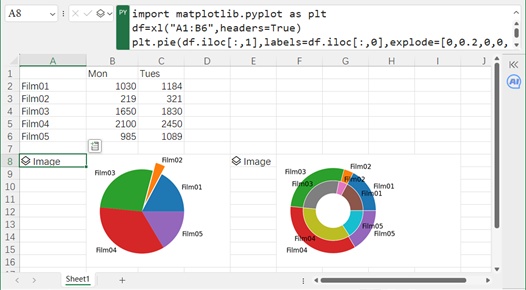
Figure 7-15
Scatter Plots
Scatter plots use numerical axes to show the distribution of points. They are useful for fitting curves and residual analysis. Use scatter() to draw scatter plots (note: different from point plots in Section 7.1.8, where the x-axis is categorical).
In the worksheet shown in Figure 7-16, cell D2 (Python mode) inputs code to draw a scatter plot of given data:
df = xl("A1:B45", headers=True)
plt.scatter(df.iloc[:, 0], df.iloc[:, 1], marker='*')  # Star markers
plt.xticks(fontsize=16)
plt.yticks(fontsize=16)
Press Ctrl+Enter to return an Image object. Merge cell range E2:I13 to display the result (Figure 7-16).
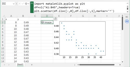
Figure 7-16
Histograms
Histograms show the distribution of one-dimensional numerical data by binning data into equal intervals and counting frequencies. Use hist() to draw histograms.
In the worksheet shown in Figure 7-17, cell D1 (Python mode) inputs code to draw a histogram of girls’ height data (Column A):
df = xl("A1:A21", headers=True)
plt.hist(df.iloc[:, 0])
plt.xticks(fontsize=16)
plt.yticks(fontsize=16)
Press Ctrl+Enter to return an Image object. Merge cell range E1:H10 to display the result (top plot in Figure 7-17; data is normally distributed).
Cell E12 (Python mode) inputs code to draw a histogram of radiation data (Column B) with 20 bins and green color:
df = xl("B1:B43", headers=True)
plt.hist(df.iloc[:, 0], bins=20, color='g')
plt.xticks(fontsize=16)
plt.yticks(fontsize=16)
Press Ctrl+Enter to return an Image object. Merge cell range E12:H21 to display the result (bottom plot in Figure 7-17; data is log-normally distributed).
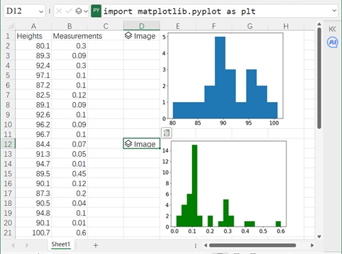
Figure 7-17
Contour Plots
Contour plots show 3D surface data on a 2D plane by connecting points with the same z-value. Use contour() for contour lines and contourf() for filled contours.
In the worksheet shown in Figure 7-18, cell A2 (Python mode) inputs code to draw a contour plot of
:
x = np.arange(-5, 5, 0.25)
y = np.arange(-5, 5, 0.25)
X, Y = np.meshgrid(x, y)  # Create grid data
Z = np.sin(X) * np.sin(Y)  # Compute Z-values
plt.contour(X, Y, Z, levels=10)  # Draw 10 contour lines
plt.xticks(fontsize=16)
plt.yticks(fontsize=16)
Press Ctrl+Enter to return an Image object. Merge cell range B2:E11 to display the result (left plot in Figure 7-18).
Cell F2 (Python mode) inputs code for a filled contour plot:
plt.contourf(X, Y, Z, levels=10)  # Filled contours
plt.xticks(fontsize=16)
plt.yticks(fontsize=16)
Press Ctrl+Enter to return an Image object. Merge cell range G2:J11 to display the result (right plot in Figure 7-18).
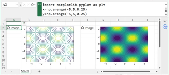
Figure 7-18
Vector Plots
Vector plots show 2D/3D vector fields. For 2D plots, use quiver() to draw vectors (direction and magnitude) at grid points.
In the worksheet shown in Figure 7-19, cell A2 (Python mode) inputs code to draw a vector plot of
:
x = np.arange(-5, 5, 0.5)
y = np.arange(-5, 5, 0.5)
X, Y = np.meshgrid(x, y)
Z = np.sin(X) * np.sin(Y)
U, V = np.gradient(Z)  # Compute gradients(vector components)
plt.quiver(X, Y, U, V)  # Draw vectors
plt.xticks(fontsize=16)
plt.yticks(fontsize=16)
Press Ctrl+Enter to return an Image object. Merge cell range B2:E11 to display the result (left plot in Figure 7-19).
Cell F2 (Python mode) inputs code to overlay a contour plot and vector plot:
x = np.arange(-5, 5, 0.5)
y = np.arange(-5, 5, 0.5)
X, Y = np.meshgrid(x, y)
Z = np.sin(X) * np.sin(Y)
U, V = np.gradient(Z)
plt.contour(X, Y, Z, levels=10)  # Contour plot
plt.quiver(X, Y, U, V)  # Overlay vectors
plt.xticks(fontsize=16)
plt.yticks(fontsize=16)
Press Ctrl+Enter to return an Image object. Merge cell range F2:J11 to display the result (right plot in Figure 7-19).

Figure 7-19
3D Curves and Surfaces
Matplotlib can also draw 3D plots. Use add_subplot(projection='3d') to create a 3D coordinate system.
3D Spiral Curve
In the worksheet shown in Figure 7-20, cell A2 (Python mode) inputs code to draw a 3D spiral curve (parametric equations:
,
,
):
ax = plt.figure().add_subplot(projection='3d')
theta = np.linspace(-3 * np.pi, 3 * np.pi, 100)
r = 10
x = r * np.cos(theta)
y = r * np.sin(theta)
z = 1.2 * theta
ax.plot(x, y, z)  # Plot 3D curve
# Set tick label font size
ax.set_xticklabels(labels=ax.get_xticklabels(), fontsize=16)
ax.set_yticklabels(labels=ax.get_yticklabels(), fontsize=16)
ax.set_zticklabels(labels=ax.get_zticklabels(), fontsize=16)
Press Ctrl+Enter to return an Image object. Merge cell range B2:E11 to display the result (left plot in Figure 7-20).
3D Surface Plot
Cell F2 (Python mode) inputs code to draw a 3D surface plot of
:
ax = plt.figure().add_subplot(projection='3d')
x = np.arange(-5, 5, 0.25)
y = np.arange(-5, 5, 0.25)
X, Y = np.meshgrid(x, y)
Z = np.sin(X) * np.sin(Y)
ax.plot_surface(X, Y, Z)  # Plot 3D surface
# Set tick label font size
ax.set_xticklabels(labels=ax.get_xticklabels(), fontsize=16)
ax.set_yticklabels(labels=ax.get_yticklabels(), fontsize=16)
ax.set_zticklabels(labels=ax.get_zticklabels(), fontsize=16)
Press Ctrl+Enter to return an Image object. Merge cell range F2:J11 to display the result (right plot in Figure 7-20).
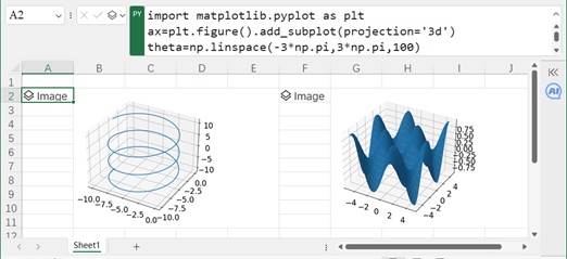
Figure 7-20